Showing posts with label UI/UX. Show all posts

Website for UX design studio


So, you decided to create your own studio. You created a perfect logotype and are going to build a website. Let's have a look what we have to do for it and what could be wrong. We decided to discover two websites from the Google search:
1) https://uxstudioteam.com/
2) https://qubstudio.com/

Design of a outsource development company website from SE Asia (Thailand): personas, usecases, implementation

Today we are going to make an analysis of an IT development company website from SE Asia: http://www.addlink.com/en/ .

Lets start from usesecases. Thai IT development company website must acquire customers in country and overseas. We are going to check this UX with four personas:
1) a Product manager from a foreign IT company who is looking for outsource agency in Asia (India, China, Thailand).
2) a Businessman from Thailand who needs development service.
3) a Startup member from USA who is looking for cheap development of their idea.
4) an Employee who is looking for new job in IT company


Google Calendar vs. Outlook Calendar: usecases and solutions of scheduling service

Online calendars and schedules are quite popular services in business. There are 2 big players between this type of  software: Google Calendar and Outlook Calendar. Lets test its features and figure out which one is better. As usual these web-services have more than 90% of users need. We will test only main usecases that are familiar for everyone and only in desktop version.


Принципи матеріального дизайну і чим він загрожує дизайнерам

Для багатьох користувачів смартфонів поява матеріального дизайну відбувался непомітно. Просто деякі додатки стали виглядіти інакше, трішки краще і веселіше. Користувачі зазвичай приписують ці якості додатку, а не технології, на якій додаток побудований. Проте різниця полягає саме у програмному каркасі для Android - Material design. Сподіваюся ця стаття допоможе вам розібратися, що ж відбулося у 2014 році в лабораторії Google.

Група дизайнерів Android взялася за задачу - розробити новий інтерфейс, який би був максимально реалістичний - тобто наслідував закони реальної фізики, при цьому залишаючися 2д. Група обрала папір у якості джерела натхнення та наслідування. У своїй лабораторії за допомогою освітлювальних приборів спочатку вони визначили найреалістичніші тіні.


How to use material design in UIs of softwares, websites and applications

If you are developing application for Android you should know what the "Material design" is. The main idea of material design is in implementing natural rules (shaddows, gravity) of outer world into UI.

A group of Android's designers started to discover real physical rules to make flat 2d design more attractive. They made many experiments with light and motions to discover how elements behave in material world.


A secret of reCAPTCHA

Did you know that reCAPTCHA technology helped to digitize text from scanned books? There were 200 million CAPTCHAs typed everyday. Scientists decided to use this labor for benefit. Detailed in video of Luis von Ahn - one of reCAPTCHA creators.

How to prevent slips in UX design

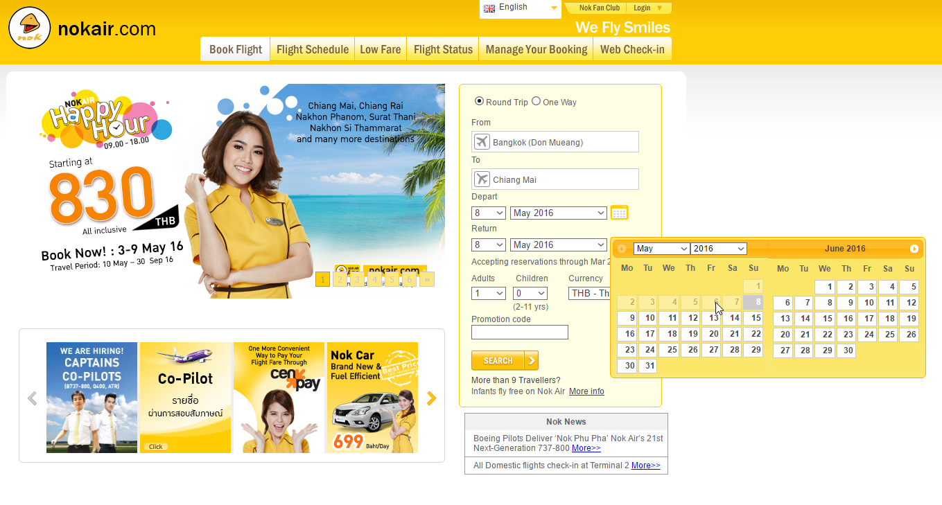
Slips is some action that users make unconsciously. For example if user press one button instead an other on keyboard. Or press "close" instead of "save". Slip can be made by experienced users as well as new one. Designers must prevent slips.

If some user can do wrong action and the system know that it is wrong - a designer has to disable this action. A return flight is always later than a departure. So previous dates might be disabled to prevent their selection. Users can free their memory from unnecessary information.


Visibility of system status


Designers usually read usecases, requirements and they know a lot about system. The interface looks familiar to them. But for the users it is not familiar. If something goes wrong - they suspect the service fault in this problem. They became scary. If designers want to avoid problems - they try to make inner processes (upload, search, update tec.) visible. We are going to talk about viability of a system in this article.


Usecases: Where should I put change language switcher button

You never have any problem with another languages in service before you come in other country. Especially if this country use different alphabet. Where users can find a language switcher? Today we will show you wrong and right places.


biodigital 3D web design


3D technology finally starts its way to webdesign. I have seen many 3D illustrations in UI but now it is possible to make UX also. Today I want to show you biodigital 3D web design on this site.

Google PageRanking Factors 2015

There are many gossips in web that PageRank is already dead. Google took this feature off  Webmaster Tools. There was even an official information that company are not going to update it anymore. Explorations of independent companies such as Searchmetrics shows us contrary results. Google permanently changes its ranking factors but don't tells about it in public anymore. It is very important for us to know where and how can we use tools to promote our web-pages. Today we are going discover some Google juice for you.


Usecase: I want to practice foreign language with native speaker online

Lets test some service for learning English online. I choose https://www.gospeaky.com for this purpose.


Lets write down what do I want?
Main usecases:
1) I want to communicate easily with some foreigners to improve my language level.
2) I want to talk with people who share my interests
3) I want to know how to do it because I have never done it before. I afraid to do something wrong.
4) My language level is not so good. I want to be sure that nobody will mock on me.


The top of the site is heavy enough but it setup friendship and happy mood. There is only button in the center that means - do not spend your time for reading a landing page, sign up!


Hand-drawn web design in landing pages and other sites


It is not so easy to make web design human friendly. Flat design and other modern trends make web site robotic. All these straight lines, uniform colors, glamour photos are not natural and they makes people feel uncomfortable like in hospital. Austrian artist and architect Hundertwasser called straight lines "godless and immoral" and "something cowardly drawn with a rule, without thought or feeling". There is one solution to make web sites human friendly – use hand-drawing design, which lively lines look far more natural. This way of web exposure became the latest trend. Let’s look through some of them.

Sitetips: If you have service business - make your web site good-natured

From this Monday I'll start a new column in this blog - sitetips. I am going to show you not only mistakes but brilliant decisions also. Today we are talking about nice and small web site from Japan: http://www.kissingkourami.jp


I do like bright, simply and good-natured web-design. Japanese are great masters of it.


Usability level without any text understanding


I want to check some local web-site to show you usability level without any text understanding. This time we'll check Ukrainian book-store http://www.bambook.com

Indigo Bookshop usability test

Internet was going to kill the paper books business. But still it helps to sell it.
I try to test usability of Indigo Bookshop as example.


EDI (electronic document interchange) system user interface and user experience design


The paperless business became a popular idea in late 90th. But technologies was very low and people used to make deal with papers. Nowadays this idea is not still realized to the end. What do we have today?  I am going to check a service for electronic document interchange (EDI) - docusign.co.uk.


Drive the e-disc!


Do you know what will happen if you upload 30 Mb file as attachment into your email? The service will upload it in the file storage. Today we will check their interfaces.


Let us test the Gmail and its storage – Google Drive.