
So, you decided to create your own studio. You created a perfect logotype and are going to build a website. Let's have a look what we have to do for it and what could be wrong. We decided to discover two websites from the Google search:
1) https://uxstudioteam.com/
2) https://qubstudio.com/
uxstudio. First of all we need to make it perfect. A design company`s website is supposed to have proper design. For example the logotype should be fixed because kerning is not ok here. But the icon is amazing. It contains U and X and looks like wire-frame.

qubstudio. Another UX studio has better kerning but is is not so remarkable and creative.

uxstudio. The color and first appearance is quite weird. I don't feel like I have come to an UX design studio. It is half-blurred, filled with green color. It could be any kind of web site.

qubstudio. And this style is quite common between UX companies. Owners might assume that it shows clear vision without distractions.

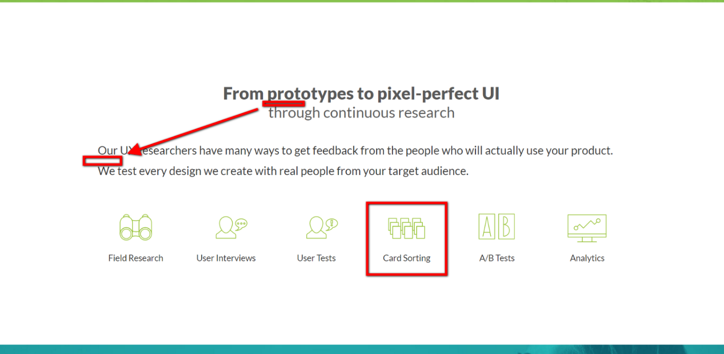
uxstudio. Users expect to see on the next screen what does the company offer. And here we have too many information. It is quite hard to keep in mind all these elements. Some of these are very specific processes like "Card Sorting" that means nothing to customers. Texts have strange leading - small in the header and big in the main text.
qubstudio. Here is better exposure. There are only 3 elements that are very clear to everyone. If some user wants to discover more he would press Read more. The style could be better because these shadows from Material design and blue text-underlined links are not trendy any more.

uxstudio. The next thing users want to check is a portfolio. It should show how previous experience of the studio is related to what this particular customer wants now. Here are portfolio slider with link to Behance. This is easy way to organize the portfolio and is ok for young design company.

uxstudio. This is just lazy and unprofessional way. Design mess. I am not sure many users would trust to the collage of studio works with Behance link on it.

qubstudio. On this portfolio user could see all completed tasks and even these projects that are in progress. It is very reliable.

qubstudio. Every project is described very well. They show all steps of development from the persona research to UI and identity branding.


uxstudio. Who could prove that the company is good in what it is doing - satisfied clients. So, users are interested in testimonials. It is necessary part of the website but testimonials are not very persuasive because users trust their own eyes more than someone's words. There are some problems with alignment (parts of one element are situated more far than 2 elements themselves) and text size (24px for testimonials)

qubstudio. I have strange feeling that design studios don't like testimonials. This one treats them like dirt. They put them on the map, made ugly alignment. Users probably would not read it because it's readability is low.

uxstudio. Pictures of the team are more reliable than testimonials.

uxstudio. The hover effect shows staff in funny way. This is not new but it shows that the studio really takes care about this part. Zsombék (FUR MANAGER) is awesome, isn't it?

qubstudio. There is similar attitude to represent the team.


Users could be interested in the workflow because there are no standards in UX business still. So, every studio has their own rules and tools. Customers could be interested in it. There is information about workflow only on uxstudio.

uxstudio. Both websites have blogs with useful information about UX and other stuff. It is good way for exposure and acquisition of new customers.

qubstudio. This studio uses as a platform https://theuxblog.com/ blog to PR itself. That is great idea to cooperate with some famous UX designer and write about UX there - with a link to the studio website.

uxstudio. If the studio is good enough user might contact. The contact form is asynchronous because user has to wait the response for many hours probably. I think users need more direct connection like - messengers, skype etc.

qubstudio. There is similar approach. Labels of the field are barely visible here.

Conclusion
UX studio are quite professional to make good website. I am sure it must be not good but perfect. The owner must take care about colors, fonts, kerning, portfolio, pictures, testimonials etc. Perfect website is reliable for customers. I haven't seen any prices there. If I want to make a decision - I should write or call them. I think is is not very useful - users need clear understanding of the price level when they are on the website. If the studio is too expensive or too cheap for me - I don't want to look through their portfolio even. This approach might decrease average time of website visit but it might increase numbers of requests.
No comments:
Post a Comment