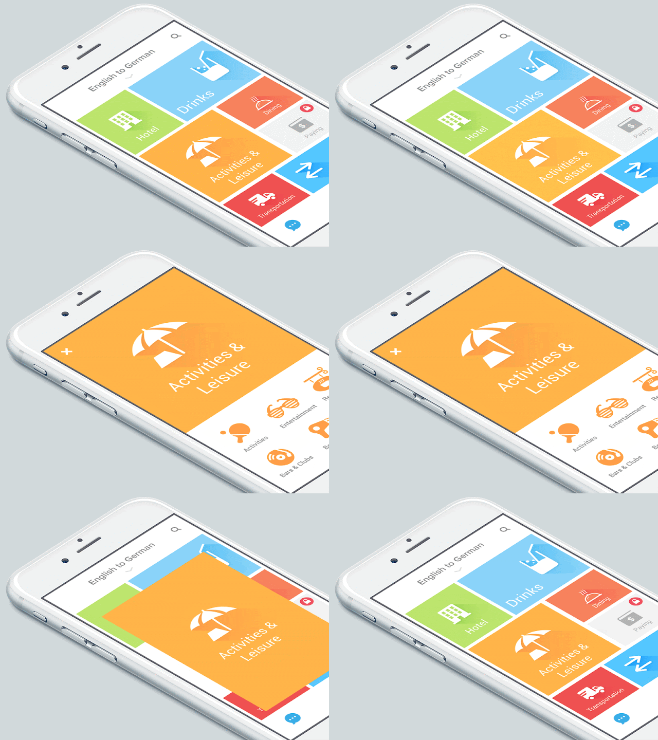
A group of Android's designers started to discover real physical rules to make flat 2d design more attractive. They made many experiments with light and motions to discover how elements behave in material world.
Users can easily recognize material design because of shadows.
Shadows make an illusion that there is a space between the application and the screen glass. But it is only small feature of the concept.
The most impressive part of material design is motion. It is a tool to make the application alive.
The movement in animation cannot be linear. Material design uses acceleration and deceleration to show this realistic effect. Elements bounce a bit while they are going to stop.
You can see here how elements appear from nowhere and stop with deceleration.
The material design is responsive. This term is overused by designers. In this case it means that users don't wait for UI response but see result of his actions (tapping, dragging etc) immediately. It never keeps users waiting. An average transition have a 1/3 second duration. Material design just "hide" this delay under the motion.

Elements in material design are aware of each other. So if you move some of them the others will move also. They call is a choreographed motion.
The motion gives you visual understanding of what is going on on the screen. Users understand where new elements are coming from.
Material design use connection between start and final screen in motion even if it is different windows. Designer used pink color from one pressed button to connect it with next screen. Users attention is captured with one element and the motion looks better organized.
One of the most recognizable characteristic of material design is to polish details. This is kind of making small elements more attractive and interactive in UI. Look how these icons become responsive.
Material design is not just a feature of Android. Actually it is big discovering of user interfaces and how they interact with users. The ideas of this project will live in future design concepts. Google created a visual language that synthesized classic principles of good design with the innovation and possibility of technology and science.
Video
Interview with designers
Full guidelines of Material Design here: https://material.google.com
Українська версія статті "Принципи матеріального дизайну і чим він загрошує дизайнерам"


No comments:
Post a Comment