Lets start from usesecases. Thai IT development company website must acquire customers in country and overseas. We are going to check this UX with four personas:
1) a Product manager from a foreign IT company who is looking for outsource agency in Asia (India, China, Thailand).
2) a Businessman from Thailand who needs development service.
3) a Startup member from USA who is looking for cheap development of their idea.
4) an Employee who is looking for new job in IT company
Usecases
UC. 1 Users want to leave an orderUC. 1.1 Long partnership with a foreign IT company (outsource)
UC. 1.2 Develop a web-site (Web Design and Development)
UC. 1.3 Develop a mobile application
UC. 1.4 Develop a desktop custom software
UC. 1.5 Develop an embedded system (IoT)
UC. 1.6 Provide IT support of existed project
UC. 2 Users want to be sure that the company is reliable
UC. 1.1 Have a look at the staff
UC. 1.2 Watch video with a CTO / CEO / owner
UC. 1.3 Check a portfolio
UC. 1.4 Check prices / costs
UC. 1.5 See the company history
UC. 1.6 See development methodologies
UC. 1.7 See an easy step-by-step explanation of a whole process
UC. 1.8 Check official documents of legal organization
UC. 1.9 Check partners
UC.3 Users want to communicate with the company
UC.3.1 Contact with the company
UC.3.2 Calculate price of a project online
UC.3.4 Leave an order online
UC.3.3 An instant chat with a manager
UC.4 Users want to work in the company
UC. 4.1 Find a job application
UC. 4.2 Watch about an employees' life inside the company
UC. 4.3 Apply CV
Implementation
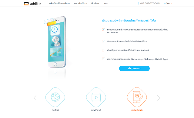
All services are represented on two sliders on the beginning of the landing page. There are Web-site, Software and Apps sections. Every section has an illustration, a short description, a bulleted list of services and a link to the online cost calculator.
User can check prices and costs of the project on a separate page with all features. There is an approximate price for average website that is quite cool and show customers the level of this company. So, they could understand it is suitable to their budget or not.
Users could find a step-by-step instruction of development process after the "Our Services" part. It stars with an order and finishes with a delivery. It is a right place for this instruction because it shows in an easy way how the company works. Users might be ready to leave the order but they need to check the reliability of the company.
A portfolio comes after "How it works" part. The design is a bit outstanding. While the website is light - the portfolio is dark blue.
Every project could be opened on a pop-up window with detailed information. It is quite hard to make good design for a portfolio part because all projects are different (from software installation to web-design). This website just cut images to the proper size. Some websites looks weird on a wide monitor because there is only top of the website visible. If users want to see whole image - they should click on the enlarge button in the right top corner.
Some technical information is on the "Development methodology" part. It is divided in sections: Design, Technology, Workflow. Logos show to experienced customers technologies that the company use in its work. This part is quite important for persona #1 "project manager" because an outsource agency's technologies must match to the same in their local company.
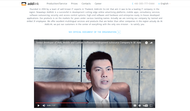
"Company overview" section proves reliability of this enterprise. Potential customers could find official document there. The link is not visible. This usecase (UC. 1.8 Check official document of legal organization) is very important for all personas and need more attention.
But video with a senior developer is very adorable. It is in English with subtitles. The video improves reliability of the company because now it is not only a page in internet but a real man in Asia who offers users to contact him.
"Our team" part is big and it is developed very good. They made photo of each employee and this makes the company's website more human friendly.
There is "Partners" section after "Our team". Users could check some famous logos like Microsoft and Dr.Web but there is no information how they really cooperate with this company. Anyway this part looks ok and add some positive impression.
The website has several ways for communication with customers.
1) a Phone number is in right top position. It is fixed along with a navigation bar to browser windows and users could see it all the time.
2) Instant messengers with a manager via Line (that is popular in Asia) and Skype.
3) a Contact form for a quick request in the bottom of the page.
Also user could send his project cost calculations to the company via the online calculator. It is good trick to get users into interaction with the website.
The calculator works very interesting. It use certain price for every usecase to calculate a total cost of a future software project. In this way customers could leave a very detailed order to the company. It also covers UC. 1.4 Develop a desktop custom software and UC. 1.5 Develop an embedded system (IoT).
What about local customers? If users come to the website from Thailand - they would be redirected to a thai version. But all foreigners could come to English version. It is possible also to change language with switcher on the navigation bar.
Ok. The main page and price / cost page almost cover all usecases of the first persona (a project manager), the second (a businessman from Thailand) and the third (a startup team member). The company looks reliable, with big team of designers, marketers and developers. Lets check how responsive is the design.
The layout changes to mobile and tablet. Even the difficult "Portfolio" part is transformed.
Every IT company need employees. IT professionals are rare free nowadays and companies tried very hard to make the work attractive. This company created special page for potential employees. There is information about opened vacancies and information about requirements.
There are video, photos and personal impressions about working in the company. It gives future employees better understanding where they are going to.
Every position has its URL so HR could post the link to certain application.
Potential employees could apply their CV to the company via interactive form.
Conclusion:
After our research we formed 4 personas: a product manager, a local businessman, a startup member, an employee and 4 groups of usecases: users want to leave an order, to be sure that the company is reliable, to communicate with the company, to work in the company. This website cover all usecases for all personas.The UI is quite modern and consist of many unique illustrations. That makes customers to believe that the company take care about its prestige and appearance.
We recommend UX and UI designers to follow this sample while they are going to create a website for an IT company.
See also
- Google Calendar vs. Outlook Calendar: usecases and solutions of scheduling service
- How to use material design in UIs of softwares, websites and applications
- How to prevent slips in UX design
- Visibility of system status
- Usecases: Where should I put change language switcher button
- Usecase: I want to practice foreign language with native speaker online
- Usecase: I am going to watch some movies online. I don’t know what movie I am looking for.


No comments:
Post a Comment