You never have any problem with another languages in service before you come in other country. Especially if this country use different alphabet. Where users can find a language switcher? Today we will show you wrong and right places.


Some services has no language switcher at all. Use English or die!


Xing has language switcher in the same language as the page. I really cannot read this so it is useless for me.

Try to change language in Chinese LinkedIn.

It is here.

Try it here. I didn't figure out.


Microsoft web-site add the globe icon to recognize language switcher. It is much better now.

But we go to another page. This is needless step. They can arrange it in a dropdown with search.
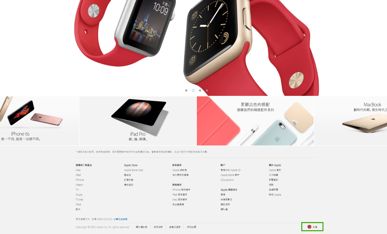
Apple use flag icon and it is very clear how to change the language.
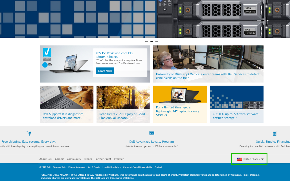
Dell uses the same trick.

IBM leaves the language switcher in English. It is really smart because usually English speakers cannot read Japanese but all the world can read English alphabet.

Dropdown is convenient way to make the language switcher if website has many of languages.

But the best solution has faceebook. It has the most popular languages in line. Users can understand that it is language switcher even if they don't speak any of these languages.
So, lets make a summary.
Wrong way to place language switcher:
- Write “language name” in the same language
- Move a language switcher from left bottom
- Make separate page for languages
- Use flag or English for word “language”
- Keep a language switcher in left bottom
- Make dropdown for languages
No comments:
Post a Comment