This one looks pretty cool. Let’s find some.
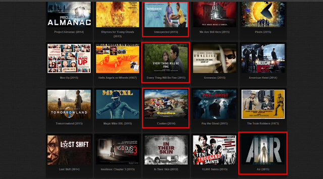
I am going to search visually. Maybe I would like some
poster. On this web site images are compressed and very small – it is hard to
figure out what is nice movie.
Here are small posters also. But then I realized that these
are categories. So I can skip all 2008 movies just because I don’t like
“Madagascar” cartoon. It is very bad way to organize website navigation.
Here is better posters presentation. They even have a IMDB
rate on it – so I can choose in two ways – by beauty of the poster and by rate
in the same time. What I really don’t like – it is mess of ugly information on
the right side.
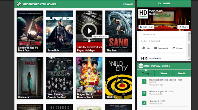
This one is also great. Posters are interactive – you can
see “play” icon when cursor is hovered over it.
I like this one. There are big posters, useful sidebar, and
nothing I don’t need.
Users can change view. Here they can see more information
about movies. Users can see what is free of charge. I think there are too much
free space in the middle. There would be some useful information like IMDB
rate. Users prefer to look at the poster when they search.
What if I want to watch some Sci-Fi movie? Let’s try filters
and navigations. Here we have “genres”.
Users will never find Sci-Fi movie on this web site.
I am very sure that filter in sidebar is the best way to do
it. And we can choose several categories in one search.
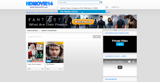
I decided to watch “The Martian”. I go to search input and
enter the name.
The search has to be interactive and show you variations
before you finish typing. Here we have to press “search” button.
Here we also have to press button – but result seams much
better. We also found some similar movie.
Finally we have interactive search.
There is also extended search.
Recap: Big posters, additional rates nearby each movie, well-organized
categories navigation, smart search -
all these features will help your customers to find some movie for their
pleasure.


No comments:
Post a Comment