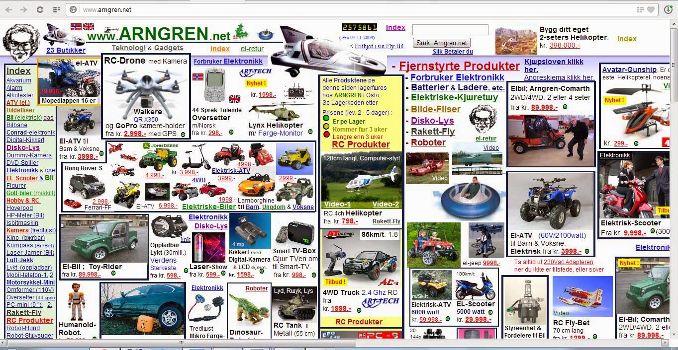
Web design has to be user-friendly from the first glimpse, without reading. Users like simplicity and intelligibility in site layout. They are afraid of a large number of details and information. Plenty of images and decoration elements make website heavy and ugly. We have to think about real functions of decoration elements before using them. Users are afraid of web pages that are full of information. Using the white space and margins is the way to solve this problem. White space brings effects of lightness. Users are afraid of fonts and colors variation because it damages perception. It is not recommended that web page has more than 2-3 fonts and 2-3 colors. Gradients and patterns, gif animation, blinking and running text were popular in 1990th because it was modern and progressive computer based style. The goal of old school web design was to amaze users with modern decoration. But now it is just a trash that hides information.
We are not going to talk about sites like these, because they are totally unprofesional.
This is web page with plenty of elements and 5 colours.
If we deleted redundant colours, hide right column and put big simply slider - it becomes more user friendly
The most user friendly design ever


No comments:
Post a Comment