
I want to check some local web-site to show you usability level without any text understanding. This time we'll check Ukrainian book-store http://www.bambook.com

The first page is a disaster. Users can’t understand that they are on the online book-shop. The logo is not related to books and looks like it is made by some pupil. Contact information is in mess in right top. Big green line in the middle of the screen is very hard and useless. Books "cemetery" in the bottom has no prices and section names on the book covers. Right and left columns are too heavy.

Search result is also in big mess. There are a lot of blank spaces. Designer can use this space better. There are section names in the center of this page. The books I am looking for is deep in the bottom.

Every book page has heavy green column that attract users’ attention. The description is under the button. It has to be after it.
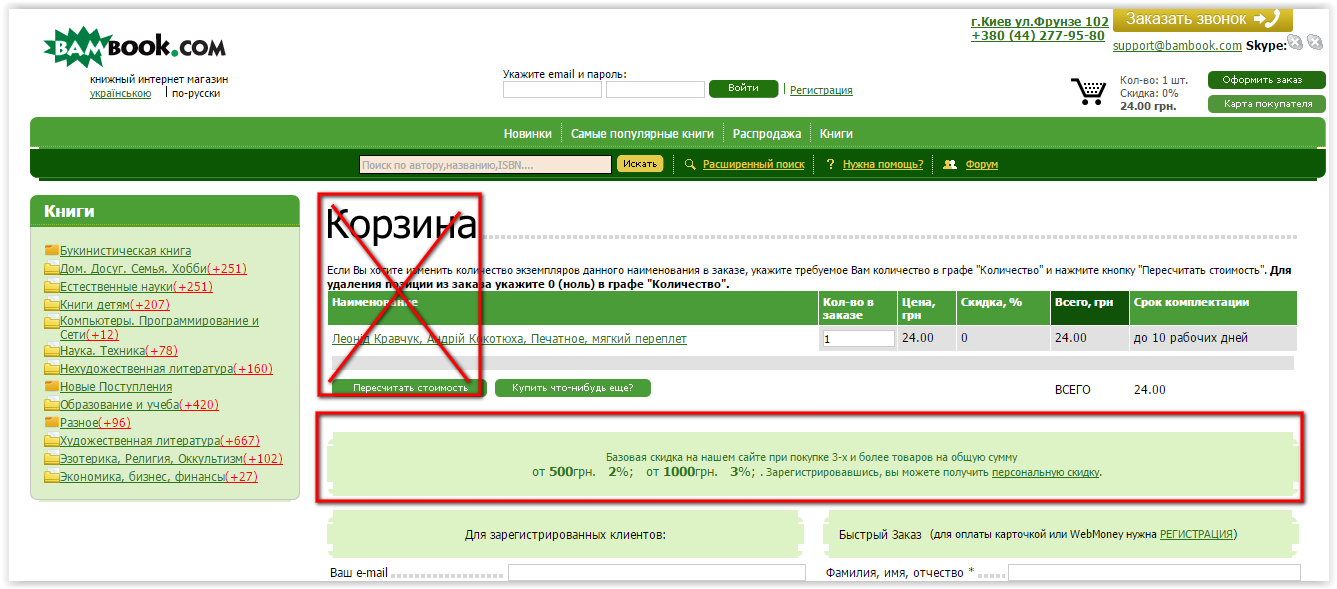
When I try to buy the book I go to some page. I can’t see my book here. I loose the "track". I have to figure out where am I. It is enough for me, I am going to leave this website.
No comments:
Post a Comment