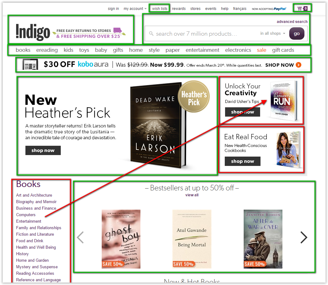
I try to test usability of Indigo Bookshop as example.
The bookstore website design has to do:
1. Make people buy the book
2. Keep them from leaving the store
3. Give them opportunity to buy more books or donate money
The first page is very important to keep random visitors.
Customers can see that they come to book shop. There is a big search input to find books. I prefer to put the books navigation into the right top side. This solution gives the quick access for people who want to buy books as a present. Usually people know friends' hobbies and can easily choose a gift in definite sections such as “Art” or “History”.
When user clicks on some book he can see a big photo of the author. This is a fault. Users loose the 'track' from the previous page. They need a picture of the book they are looking for – not the author.

The book’s chaotic description is underneath. The information "Details" has to be divided with font-weight or font-style. There are several prices to the right. The marketing department wants to show some smart discounts but... I don't understand what it is. Users feel angry and upset when they cannot understand clearly the information. This part has to be carefully usability tested. "Shop now" button is ok. But, what I have to do if I am not sure to buy this book? I need some references! If you give users way to escape - they will use it.
This is another way to lose the customers. If they scroll to the end and find noting - they will go away.

The search is made nice. Users can find the book even if they miss the letter in the name. This list people can sort with several sophisticated systems.
"Save to wish list" option became popular after its success in Amazon.com. But gift list is something new. It is amazing idea for such stuff. Many customers spend long time thinking about. And it is cool if we can control it and use it in further advertisements.

The gifts fall down in the bottom part of the site. I like the way it goes.
Here are many odd things like “code” input or something. UX designer have to check the percentage of users who need it. If it is less than 15% - he has to hide it in some way. It is cool that users can checkout with PayPal. The sign about free shipping has to be closer to the main button.
Good stuff is donation window. It draws more money and customer's loyalty.
Registration is not obligated. It is good for users who hate registrations. But it is very important to catch them. Book store can collect the information about user’s preferences and give them direct book advertisement inside the system. Also this is the way to keep high loyalty of users - website can give them discounts, presents. Marketing department can communicate directly with users. So, the lure (massege “You could save money”) has to be more visible. The cover is too small here. Users don't see what they are buying and it is a fault.
Let’s estimate this website design.
1. Make people buy the book – good
2. Keep them from leaving the store – bad
3. Give them opportunity to buy more books or donate money - middle
The website is made pretty well. But it still needs UX testing.


No comments:
Post a Comment