Do you know what will happen if you upload 30 Mb file as attachment into your email? The service will upload it in the file storage. Today we will check their interfaces.
First – you cannot understand what this service is for. The logo and the name tells us nothing to figure out the service. When new users see the Google Drive icon – they would not understand what is it. Anyway users don’t know exactly how many Mbs they can attach. So, users just don't need this button here.
Therefore, they usually click paper clip icon. The system analyzes how heavy the file is and gives you unnecessary massage that you are out of 25 Mb email limit. “But don’t worry? You can sent it using Google Drive.”
I can understand it from the marketing point of view. If you divide the service into the parts – you can sell more. MacDonalds uses it a lot – they sell you fried potato and always offer you to buy sauce in addition to main menu. I don’t think it have to be like this with free online services. Users do not have to know what e-mail limit is. Service have to upload it to another service in silence.
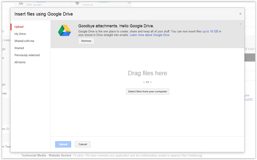
Google opens the window “Insert files using Drive”. Users have to upload files to this window again. This is third unnecessary step. The next one is “Upload” button. Service force users to do four steps except one.
The link to file in the email has no “Download” button. Many users cannot figure out where they have to press if it looks not like the link or button.
If you don’t have Google account – you cannot download it. So, Google cannot share files with other email networks.
But the most fantastic thing happens when you press on the attachment. Instead of download – it opens the attachment in new window. Just try to understand what is it and how to download the files.
This is another service of Google – Doc. Let’s look at this page in details. What does user usually do when he receive mail attachment? He views or downloads it. The service has to show files and gives you understandable buttons under the file list – “download” and “view” in case if we can open it in browser. The download button is very small icon and it stands over the files among another undefined icons. You cannot exit from here because here is no exit button. Users are trapped here. One "amazing" thing - the top left link with the name of the file is for … renaming the file.
Open button makes users feel stupid. Why do they have to choose application for this case? Service has to choose it automatically.
I am going to check another e-mail storage services (freemail.ukr.net and mail.yandex.ru) to feel the difference. Here are two buttons “file” and “file from eDisc”. Users don’t figure out what are they for. Why does it use “file” except of “upload”? Why does it give you hesitation where do I have to click?
Ukr.net shows to users message that weight of the files is bigger than 18Mb but they have an opportunity to upload it with service eDisc. Users do not care about Mb, size, and services. His only wish is sending a file to recipient. It is cool that here is “use always” checkbox and users will never see this window again.
The link inside the letter has Mbs information that gives you a tip. This is good way to highlight the link.
Users cannot download file without account. At least – they can see the file name and type here.
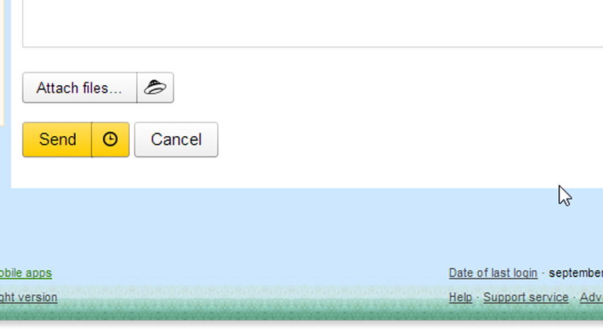
It is Mail Yandex. Here is clear massage to users – Attach files and the logo of “Yandex Disc” nearby. So users can understand that UFO and the "attach" button are connected.
The uploading process is simple. Users do not understand that other service is processing. Only tiny gray link “The following files have been uploaded to Yandex.Disk:” gives us opportunity to go out of the mail.
The link inside the letter is also not very clear but it is blue underlined link that people use to click on.
On the next page we can see the file even if users have no account in the service. You can see big and clear buttons “View” and “Download”. It is right and simply way to send big files.
Drive the e-disc!, 2014


No comments:
Post a Comment