People react on faces much more than on any other objects. We used to see faces even in abstract paintings. Scientists discovered that there is fusiform face area in human brain that recognizes faces bypass normal image perception. This phenomenon is frequently used in commercials. Designers put people in ads to promote wares. This trick is powerful but for some reason seldom in web-design. Xing uses faces widely. We can see it here from the first page. Professional pictures with smiling people make the first impression friendly.

 You can quickly sign up on the first page if you have no account yet. Account creation is situated in the right or left side of many popular social networks web-sites. You have to fill forms with some personal description after registration.
The next step is choosing account type (free or premium). I think this is not good for start because people haven’t even tried the network but someone already wanted their money. Purchase offer annoys internet users because they can have many things for free.

Users can find their friends in this network via email on the next step. This is also not very clever because instead of seeing the new account you have to think about email security and spam massages “your friend has regiterated in some new web site”.

Xing forces you to make contact with other members. You spend another four steps before you start your working. It is some kind of website aggression but it has nice and attractive form. Handwriting style of circles and strokes is really cool. It is the sign of designer’s care about the small details. Here we can make a conclusion that there is a disproportion between efficiencies of UI/UX and decoration departments in Xing. Web-site is decorated well but there are a lot of usability problems in it.

Finally we can see our empty account. There is a nice big circle that shows us how many percent of set up work we have already done. Empty avatar communicates with users and tempts them to upload photo and fill the gap. Big buttons are also very remarkable. But all these important objects are in chaos on the page. It is better to put them in order and break them in many steps like on this page below.

Dividing "set up process" into parts is great trick. Users can quickly go to form they are interested in (portfolio, other web profiles etc.) Users have to have a possibility to skip forms they don’t want to fill. Other important design trick is to help people fill the form easily like in “Wants” part. Designers put a big grey plus to prompt users fill the information. Here is also text “What are your wants?” to explain what exactly they have to write here in case users don’t understand what to do.

Have a look how lovely Xing designers put portfolio adding process in order. They divided it in three parts and made their own icon for each.

I like “Add something” button up there. The greedy trick is that you can upload only three photo in there and than the site asks you to buy premium account.

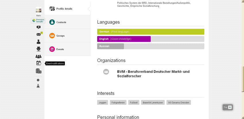
There are a lot of nice design solutions inside this web-site. Yellow circles and strokes display professional experience in some kind of diagram. All parts of it are interactive.
Every link and object is interactive. It is highlighted when you put the mouse over. Some icons show us the descriptions of links.

The avatar changes if you move the mouse over into big button.

Designers made communication with users shorter because many links are replaced with icons. They are done in one style and they are a part of corporative identity.


Xing widely uses good photos of happy successful people to attract attention to ads and web-site at all.
So, Xing showed high level of visual decoration and objects ordering. But the User experience design is on very low level. Many steps are annoying and unnecessary. Xing can skip many parts that make users feel uncomfortable on the site. Also they have to be more open-minded and less greedy. Only three photos in free account is very disrespectful rule.
No comments:
Post a Comment